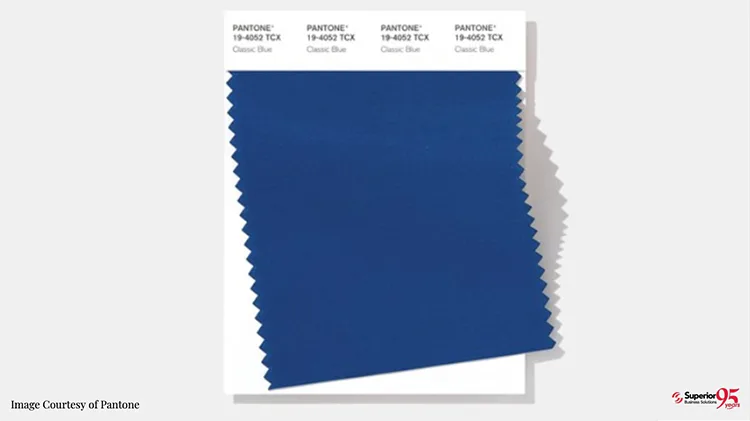
Pantone Color of 2020 Is 19-4052 Classic Blue
I’m feeling a little blue today. To be honest, I’m feeling a lot of it. But not because I’m sad or unhappy. I’m just celebrating the announcement of Pantone’s Color of the Year for 2020: Classic Blue. And I think it’s an interesting choice.
Some of Pantone’s philosophical explanations might make skeptics roll their eyes. But they make some pretty good arguments. Blue is the classic, stable, peaceful color. Clothing? I’ll bet you’ve worn blue jeans and felt very comfortable in them. And I’ll bet you’ve felt happiness and relaxation looking at a bright blue sky or enjoying the water view from a beautiful beach.
Calm for Contemporary Times
Pantone chose “Classic Blue” for many reasons. One big one is that blue inspires a sense of rest and tranquility. And with the turmoil we’ve been enduring on many fronts, from political wrangling to social media snarkiness, we could all use some of that. It even brings a sense of unity; classic blue is the universal color of the sky at dusk, as seen everywhere around the globe.
Blue’s enduring popularity in fashion, fabrics, interior design and pop culture suggests a “staying power” that helps reassure us. We—like classic blue—can and will thrive and get through this stronger than ever. It’s a soothing transition from where we are to where we’re going.
Make Your Marketing Stronger Than Ever
Hope you didn’t tune out thinking this post was all “artsy” talk. You should know me better than that. I’m introducing you to Pantone’s Color of the Year for 2020 for a good reason. It can help make your marketing get more notice and win more customers in 2020, too.
Color trends start small but are soon evident almost everywhere. What begins as a subtle shift among designers evolves into broad popularity with consumers around the world. You will begin to see it in the clothing at high-end department stores and the paint and accent choices on popular home decorating and makeover shows.
And if companies are smart enough to get ahead of the curve, you’ll see it in their marketing materials, too.

Use Classic Blue to Promote YOU
Often consumers don’t even realize it, but they are drawn to colors that are part of emerging trends. They start to notice those “hot” colors. And consciously or not, they feel more positive toward brands that are contemporary enough to use them.
If your materials use classic blue or a variation, you appear more “fashion-forward” and up to date in general. But how, exactly, can you tap into this potential opportunity? I’ve got some ideas.
Where Does Blue Belong in YOUR Marketing?
There are many ways for you to get behind this trend and ahead of your competition. Our CMO has already spoken to a friend who is already using it in a new marketing campaign for a recovery facility. But use your imagination to think of ways you might use this color in 2020!
Color trends are critical in the world of fashion. And promotional apparel is very popular with employees, customers and prospects alike. Your promotional efforts will be more effective than ever when the apparel bearing your company’s logo looks great and reflects the most desirable fashion statement in 2020: classic blue.
-
Event Marketing
Event planners are always looking for ways to make their events fresh and memorable. You can use that same kind of thinking for any meetings, conferences or employee get-togethers you organize. Think classic blue in your table accents, registration table clothes, drapes for booths or separation, and more. Attendees may not think specifically about your color choices. But the event itself—and whatever its purpose—will feel more special.
-
Promotional Print Marketing Materials
Ever notice how many insurance companies and financial services firms have logos and corporate identities that feature blue? That’s no accident. It reinforces that feeling of calm, trust and reliability. That alone would be a good reason to use it in some of your 2020 marketing materials. And don’t forget those forms you use every day in the course of your business. That subtle exposure to classic blue may help your customers see you as not only timeless and dependable but smart and knowledgeable about the latest advances.
From the least expensive trade show handout to the special gifts you give to your best customers, classic blue can make them “a shade” better. We have more resources than almost any other promotional product partner with thousands of trusted sources. From fidget spinners and PopSockets to Yeti coolers and cozy blankets, color can play a role. Those items will just seem more desirable when they sport the “color of the year.”
-
Create a (Blue) Classic!
There’s nothing fresher than “unique” So why not work with us to use classic blue in a brand-new way. Maybe it’s a chess or checkerboard with classic blue squares! Or a classic blue putting mat for your client’s office or “man cave.” Classic blue coasters with your company branding? We have 95 years’ experience in creating ways for businesses to be more efficient. Let’s see what we can come up with!
We Have a Lot in Common with Classic Blue
Like classic blue, Superior has come to stand for reliability, too. We’ve earned three consecutive Best of Print and Digital awards based on reviews from our customers. And as for trustworthy – our ISO certification is certainly something you can count on.
Contact one of our award winning sales reps and ask for a FREE promotional item review. We’ll also be happy to help you make the most of the color of the year and your 2020 marketing campaigns.