When you think about marketing that packs a punch, your thoughts most likely turn to the list, the pitch, and the incentives. But when it comes to the design, how much thought do you put into your images and the color of your graphics? As long as they look good, is that enough? No! One of the secrets to powerhouse selling is knowing how images and color influence the buying decision.
Graphics have better recall than words, so they are a critical part of the mix. In fact, according to PR News, visual content is key to communicating your brand and drawing the attention and interest of consumers. Studies show that people remember 20 percent of what they read but about 80 percent of what they see and do. Your target audience will remember the images, even if they don’t remember the text, so your images have to do more than look pretty. You need to select images that communicate the same message you are communicating through your copy.
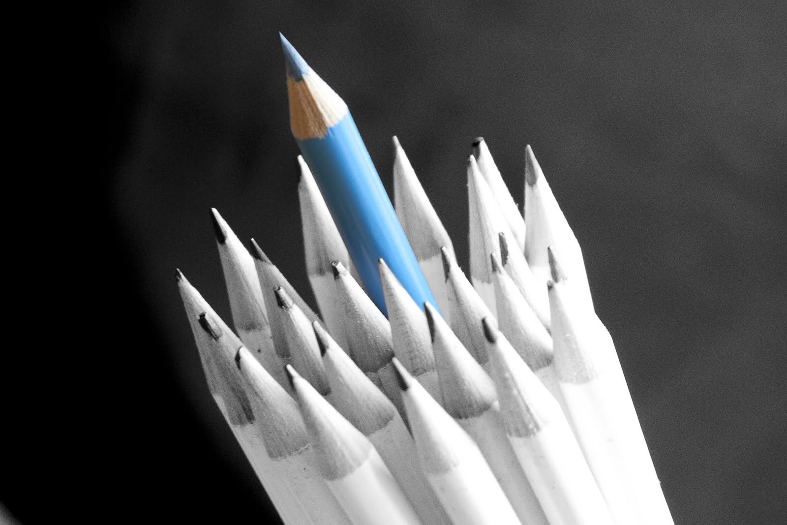
Color is an emotional trigger, as well. Every shade has both a positive and a negative connotation, however, so it needs to be selected carefully. For example . . .
- Red is a dominant color that might successfully evoke an image of love and passion, but it might tap into the darker feelings of rage and violence, too.
- Green can stimulate thoughts of money and self-actualization, but greed and envy are associated with this hue, as well.
- Yellow is associated with happiness and joy, but if you are marketing products to men, it can be seen as childish and inappropriate for merchandise associated with prestige.
Great marketing starts with a relevant list and a great message, but they only tell half the story. Pair a great list and powerful message with an understanding of the critical roles of graphics and color and your efforts will be outstanding.