Ultra Violet Represents ‘Hue-mongous’ Possibilities
Hello again, and Happy New Year, everyone! On Thursday, I’ll resume our series on assessing the benefits of various marketing enablement tools. But I thought I’d add a little color to this first post of 2018 by departing from the usual just a bit. Pantone® (as many of you know) is the most authoritative source of color and color information in the design industry. Its “PMS” color system has guided art directors and graphic designers for decades.
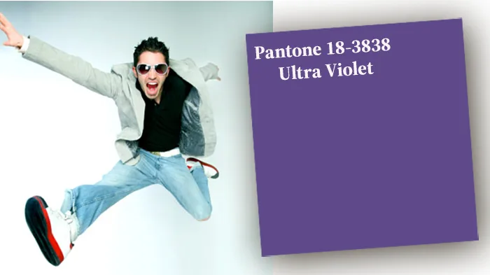
Well, every year, the company looks ahead to announce a “Pantone Color of the Year.” That choice, as the company says, does more than point to a “hot trend.” It attempts to consider the state of the world and the focus of its citizens. The chosen color purports to offer elements of inspiration that will not only foreshadow, but foster the future in aesthetic ways. This year, that important responsibility falls to Pantone 18-3838 Ultra Violet. Congrats, UV!
Color Resonates
Now, since printing is at the core of our business, I certainly appreciate what color can do. We know the difference a quality four-color printed piece can make in engaging prospects and customers. But I have come to understand better the impact a color choice can make on something of a deeper level.
Pantone’s Color-of-the-Year announcement goes into more detail about Ultra Violet’s ability to raise our awareness and lift our potential. I won’t attempt to recreate the lofty tones of that discussion here. But I certainly see why Ultra Violet seems so appropriate for today, in terms of where we are and where we are going.
Deep Color Inspires Deeper Thinking
Maybe with a more simplistic approach, we would choose red, since everyone seems angry these days. Or yellow, since many are fearful of the future. Even green, since money drives so many decisions. But a holistic look at our society suggests a more pensive discussion. We need to think our way through intricate political and international environments, not to mention the challenges to our natural one.
Science and technology are advancing at a mind-numbing pace. At the same time, behavioral experts suggest that quiet meditation and mindfulness are more important than ever to our well-being. For me, Ultra Violet suggests both. In it, I see the dark night sky that makes me think of galaxies and distances impossible to comprehend, and a future that inspires awe (even as it makes my brain hurt a little).
But Ultra Violet also feels contemplative to me, rippling inward. It’s not a see-it-everywhere primary color that makes me think of traffic lights or children’s toys. Rather, it feels carefully selected to make me reflect on where and who I am, and how I can respond creatively to the challenges I face.
Artistic. Spiritual. Inventive.
Stare into Pantone 18-3838 a bit. You might find that it boosts your imagination, and makes your mind wander in new directions. Maybe it’s just that outer space thing again, but I see it as more of a “doorway” color than a destination. And that’s just what we need right now, for our businesses and for our personal peace and satisfaction.
Have a great year. And as always, we at Superior Business Solutions will be here to do everything we can to help. I’m really looking forward to sharing my thoughts with you here throughout the year, and I’m hoping you’ll feel free to share yours with me.